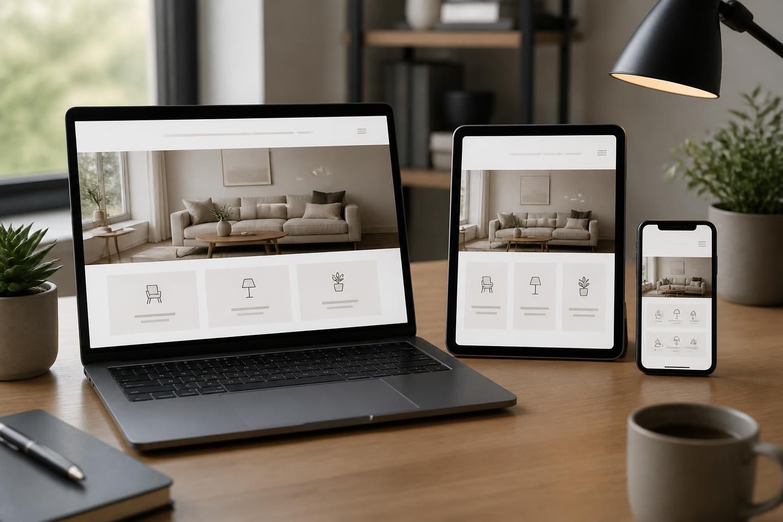
If your website looks fine on a desktop but falls apart on a phone, visitors notice fast and leave faster. Buttons feel too small, text wraps awkwardly, images crowd the page, and forms become frustrating right when someone is ready to contact you.
That lost momentum can cost real leads for a local business. Lynchburg Website Design helps companies across Lynchburg, VA fix that experience with responsive web design that adapts cleanly to phones, tablets, laptops, and wide screens so people can find what they need without friction.
Most visitors do not arrive through a large monitor and a quiet office chair. They arrive while searching on a phone, comparing a few options, and trying to decide who feels easy to trust. If the layout forces pinch-zooming or makes the call button hard to find, the visit ends early.
Responsive web design starts with the smallest screen and builds upward. That approach keeps the page readable, the navigation clear, and the key actions easy to tap. For local service businesses, that often means more calls, more form submissions, and less confusion for people who are already ready to buy.
We reshape the page so the most important content appears first and the rest supports the decision. That usually includes tighter spacing, stacked sections, touch-friendly buttons, and simplified navigation that does not crowd the screen.
Your brand still looks like your brand. Colors, messaging, and visual style stay aligned across devices so customers get a consistent experience whether they find you from a desktop search or a late-night mobile search.
A responsive site is not just about appearance. It solves the practical problems that keep visitors from taking the next step. If your current site creates any of the frustrations below, it is likely costing you attention and trust.
Lynchburg Website Design reviews these issues with a conversion-first mindset. That means we are not just asking whether a page fits the screen. We are asking whether it helps a person move from interest to action without hesitation.
Responsive web design works best when it is intentional from the start. We design the structure, spacing, content blocks, and calls to action so the page scales smoothly instead of shrinking a desktop layout until it becomes hard to use.
We map the page around the actions that matter most, such as calling, requesting a quote, or reading service details. That keeps the structure focused and avoids clutter.
We shape the visual hierarchy so headlines, buttons, and trust signals remain clear on mobile, tablet, and desktop screens.
Shorter sections, cleaner spacing, and stronger calls to action help users scan quickly and find the right next step.
We review the site on different screen sizes to catch layout problems before launch and reduce awkward surprises after visitors start using it.
This process gives local businesses a site that feels easier to use from the first visit and more persuasive when someone is comparing options.
Responsive design should do more than adapt. It should guide. Every section of the page has a job, whether that is introducing the offer, answering questions, or leading a visitor toward contact. When those pieces work together, the site becomes a stronger sales tool.
Lynchburg Website Design builds responsive pages that support this flow by placing attention where it belongs. Clear headings, direct messaging, and visible contact paths help reduce hesitation. Instead of making visitors hunt for information, the page brings it forward at the right moment.
A responsive page needs contact prompts that are easy to spot and easy to tap. We place them where they make sense, not just where there is extra space.
People often visit a site to confirm whether a business handles a specific need. We make those service details easy to scan without forcing users through walls of text.
Many businesses already have a website but need a layout that performs better on modern devices. Others need a new build that can support future updates without becoming difficult to manage. Responsive web design works well for both situations.
For WordPress sites, we build with clean structure and a thoughtful plugin setup so the site remains easier to maintain. For redesign projects, we look at what is slowing the current site down and rebuild the experience around the goals that matter most. That can be especially useful for local businesses that want a more polished online presence without starting over blindly.
We also create responsive landing pages when a campaign needs a focused destination. Those pages keep the message tight and the action clear, which can help paid traffic feel less scattered and more intentional.
Responsive web design matters even more for local service companies because visitors are often making quick decisions. They want to know what you do, where you serve, and how to reach you without digging through layers of content.
Businesses across Lynchburg, VA and nearby areas such as Forest, Madison Heights, Rustburg, Amherst, Altavista, Appomattox, Bedford, Boonsboro, Downtown Lynchburg, Timberlake, and Candler's Mountain Lynchburg can benefit from a site that presents information clearly on any device. Whether the visitor is researching from the office or checking options from a phone, the experience should feel direct and reliable.
They usually want quick answers, clear contact details, and a page that looks organized from the start. A responsive layout helps deliver that without making them work for it.
When you work with Lynchburg Website Design, the process stays centered on your business goals and the way your audience actually uses the site. We start by understanding what the page needs to accomplish, then shape the design around those outcomes.
You can expect attention to structure, clarity, and usability throughout the project. That includes reviewing how content stacks on smaller screens, how buttons appear under touch, and how the page guides users toward contact. We also pay close attention to visual consistency so your site feels complete across all device sizes.
If your current website is already getting traffic but not enough action, responsive web design can help close that gap by making the experience easier to trust and easier to use.
It makes the page easier to read, tap, and navigate without zooming or side-scrolling. That reduces friction and keeps people moving toward the information they came for.
Yes. Many older layouts can be redesigned so they work much better across devices while keeping the parts of the site that still support the business.
It should. A strong responsive design keeps the same look and message while adjusting the layout so it feels polished on each device.
They do, especially when visitors want contact details, service information, and quick proof that the company is easy to reach and easy to understand.
Yes. Landing pages often need a focused message and a clear action, and responsive design helps keep those elements easy to use on phones and tablets.
Helpful starting points include your services, target audience, current website if you have one, and any contact or conversion goals you want the page to support.
If your website is not giving mobile visitors a clear path, it may be time for a better layout. Responsive web design can make your business easier to understand, easier to contact, and easier to choose.
Lynchburg Website Design helps local companies across Lynchburg, VA turn a crowded or awkward site into a cleaner digital experience that works across screens. If you want a website that feels built for real visitors instead of just looking good on a mockup, we can help.
Contact us today: hello@lynchburgwebsitedesign.com or +14344737271. Visit us at 4925 Boonsboro Rd, Lynchburg, VA 24503, USA.
Let’s Build Something Better
Tell us about your business, your current website, and the kind of results you want. We will help you choose the right design, development, or SEO path for your goals.